Table of Contents
How to Choose the Right Colors for an Indoor Playground: A Professional Design Guide
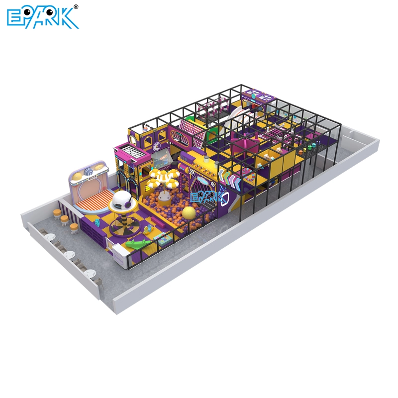
Choosing the right colors for an indoor playground is more than selecting bright shades that look fun. Color planning affects children’s emotions, safety, wayfinding, and overall play experience. A well-designed color strategy can also strengthen your indoor playground theme, support age-appropriate activities, and improve user satisfaction.
If you’re planning a new facility, you may also want to read:
How to Design a Custom Indoor Playground
Choosing Commercial Soft Play Equipment
Understanding Age-Appropriate Color Needs
Toddlers and Preschoolers (Ages 1–5)
Young children respond better to softer tones because these colors create comfort and reduce sensory overload. Soft blues, light greens, pastel yellow, and peach pink are ideal for toddler zones in an indoor playground. These shades support calm exploration and help children stay focused during early-development activities.
School-Age Children (Ages 6–12)
Older kids prefer brighter, high-energy colors that stimulate activity. Red, yellow, orange, and electric blue work well in climbing zones, slides, ball pits, and racing tracks. These colors support cognitive excitement and encourage physical participation.
Psychological Effects of Color in Kids’ Indoor Play Areas
Color psychology plays a major role in playground design. Below is a clear guide to using each color effectively:
| Color | Emotional Effect | Recommended Use in Indoor Playground |
|---|---|---|
| Red | High energy, stimulating | Slides, challenge zones, obstacles |
| Blue | Calming, improves focus | Quiet rooms, reading areas, parent seating |
| Yellow | Cheerful, attention-grabbing | Signage, interactive games |
| Green | Natural, balancing | Relaxation zones, nature themes |
| Orange | Friendly, social | Group play, activity hubs |
| Purple | Creative, imaginative | Fantasy themes, pretend-play zones |
Using these effects strategically helps maintain the right balance between excitement and comfort.
Professional Color Combinations That Improve Indoor Playground Design
Balanced Palettes
The best indoor playgrounds combine warm and cool tones to avoid overstimulation. Examples include:
Sky blue + orange
Green + yellow accents
Neutral beige + red highlights
These combinations create a dynamic but comfortable environment.
Accent-Driven Color Strategy
Accent colors guide children to key attractions, making spaces easier to navigate.
Examples:
Red → slides, tunnels
Yellow → sensory panels, interactive walls
Blue → quiet or transition zones
This design method improves visual hierarchy and circulation.
Safety, Visibility, and Compliance Standards
Color design is not just visual—it contributes to safety and compliance.
High-Contrast Safety Visibility
International standards like EN1176, ASTM F1918, and ADA guidelines recommend high-contrast edges to help children recognize depth and boundaries.
Effective contrasts include:
Light-dark step edges
Bright borders on climbing structures
Contrasting wall corners
Avoiding Dark, Heavy Shades
Dark browns, black, and deep maroon may reduce visibility and make a space feel smaller. They also create shadows that make supervision more difficult for staff and parents.
To learn more about equipment standards, visit:
Indoor Playground Safety Guide
Theme-Based Color Selection for Indoor Playgrounds
Nature or Jungle Theme
Perfect for soft play and family entertainment centers:
Forest green
Earth brown
Sky blue
Sand tones
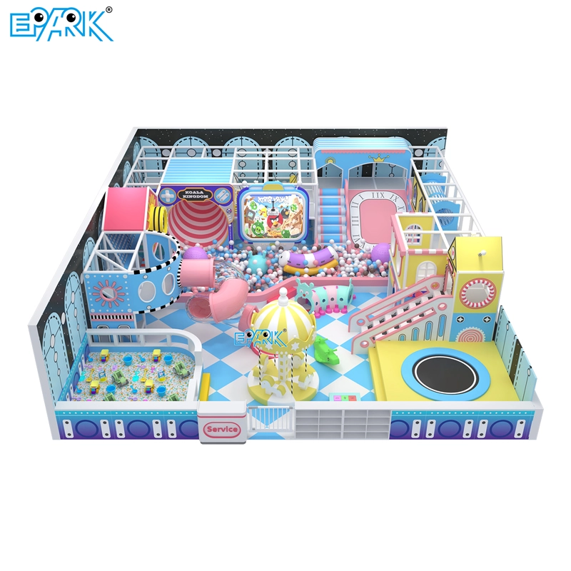
Ocean or Space Theme
Good for climbing zones and ball pits:
Navy blue
Aqua green
Silver
Neon accents
Modern Abstract Theme
Ideal for malls and boutique indoor playgrounds:
Red, blue, yellow
Black geometric lines
White backgrounds
Color-theme alignment enhances brand identity and user immersion.
Using Color to Create Functional Zones
Different areas inside a kids’ indoor playground require different levels of energy. A color-coded zoning system improves navigation and supports child behavior.
| Zone | Recommended Colors | Benefits |
|---|---|---|
| Active Zone | Red, orange, bright yellow | Boosts energy and engagement |
| Toddler Zone | Pastels | Comfort + reduced stimulation |
| Learning Zone | Sky blue, soft green | Enhances focus |
| Party Room | Multi-color accents | Creates excitement |
| Parent Area | Neutral + soft blue | Comfortable and relaxing |
Color zoning reduces confusion and helps staff supervise more efficiently.
Maintenance and Durability Factors
Color choice affects cleanliness and long-term durability—both major concerns for indoor playground operators.
Light Colors Show Dirt More Easily
White, ivory, and pale yellow surfaces can show shoe marks or fingerprints quickly. These may require daily cleaning.
Multi-Tone Designs Hide Wear and Tear
Patterned PVC floors, speckled foam pads, and textured wall panels hide scuffs better.
UV-Resistant Color Materials
If your indoor playground receives strong sunlight, UV-stable pigments prevent fading and maintain color quality for years.
Read more:
How to Maintain Indoor Playground Equipment
Inclusive Color Design for Sensory-Sensitive Children
A high-quality indoor playground should offer an inclusive environment. Many children with sensory processing differences may become overwhelmed by intense or flashing colors.
Effective inclusive strategies include:
Using soft gradients instead of sharp contrasts
Avoiding overly intense neon lighting
Creating color-calm quiet rooms
Providing visual transition spaces between zones
This supports ADA-friendly design and encourages participation from all children.
Color Planning Based on Space Size and Lighting
For Indoor Playgrounds With Limited Natural Light
Use lighter tones to brighten the atmosphere and maintain visibility.
For Large, Bright Facilities
You can safely introduce deeper colors such as teal, forest green, or magenta, as natural light offsets visual heaviness.
Recommended Indoor Playground Color Schemes
Calming & Soothing
Pastel green
Soft lavender
Light blue
Pale yellow
Energetic & Playful
Red
Bright yellow
Royal blue
Orange
Nature-Inspired
Forest green
Brown
Beige
Sky blue
Abstract & Modern
Primary colors
Black geometric accents
White base
Conclusion
Color selection is a core component of indoor playground design. It influences mood, behavior, visibility, safety, maintenance, and user experience. When used strategically, color can enhance play value, improve circulation, and reinforce your branding.
For investors, designers, and operators, a thoughtful color plan ensures that your indoor playground stands out while delivering a better, safer, and more engaging play environment.
If you need help designing a themed indoor playground or selecting equipment, I can help create a full color palette, rendering, and layout plan.